GRAPHIC DESIG for the exhibition
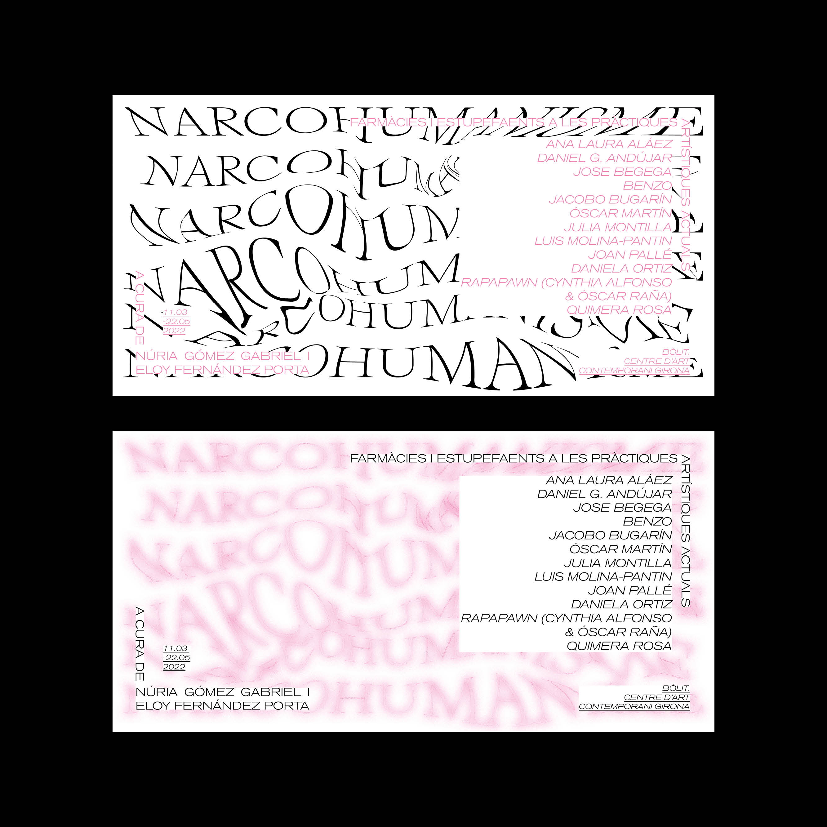
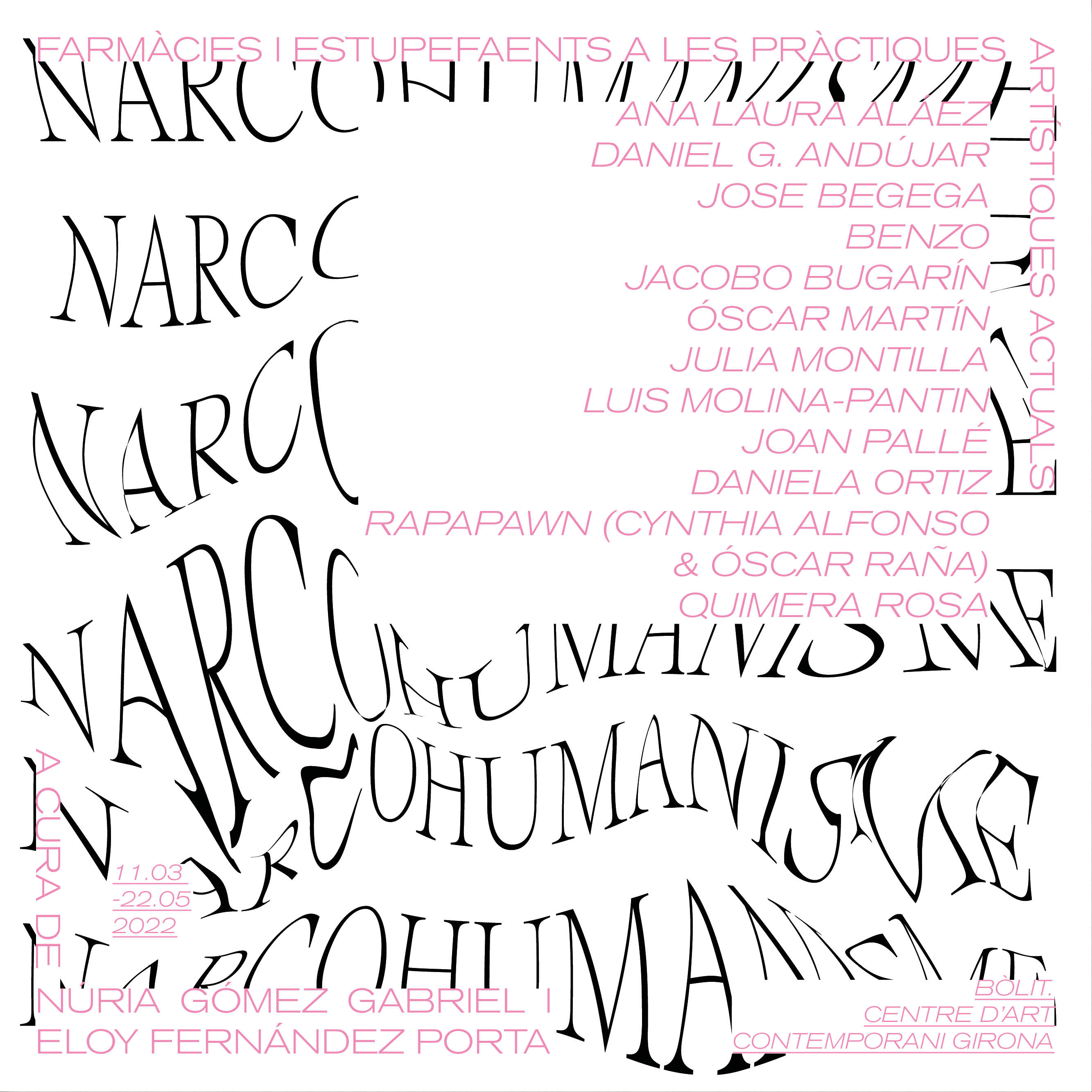
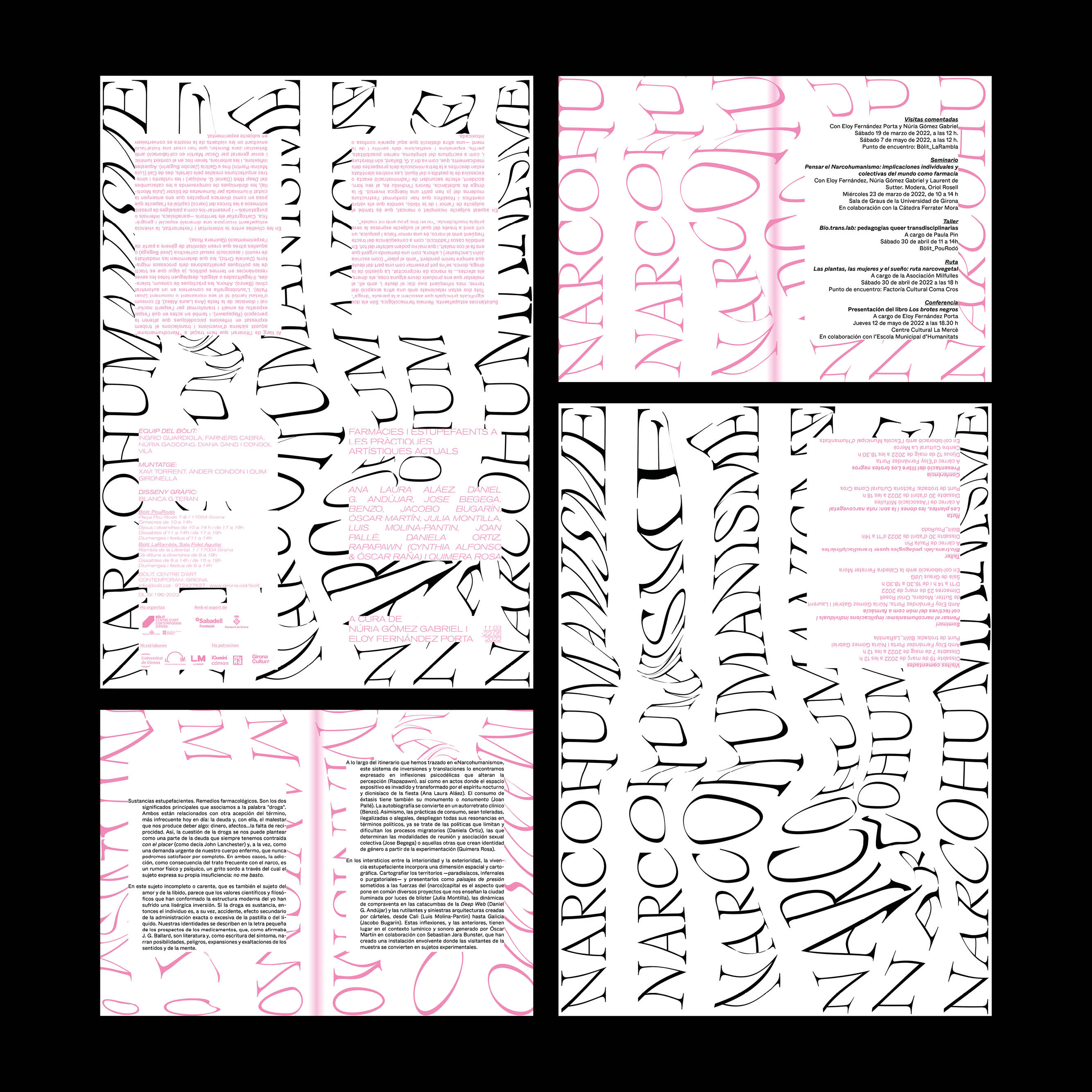
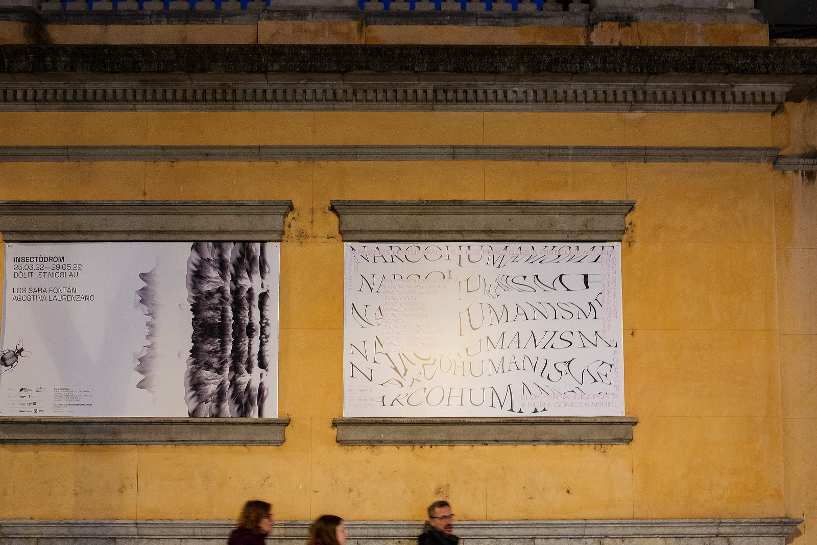
NARCOHUMANISM
Pharmacies and narcotics in current art practices
Curated by: Núria Gómez Gabriel & Eloy Fernández Porta.
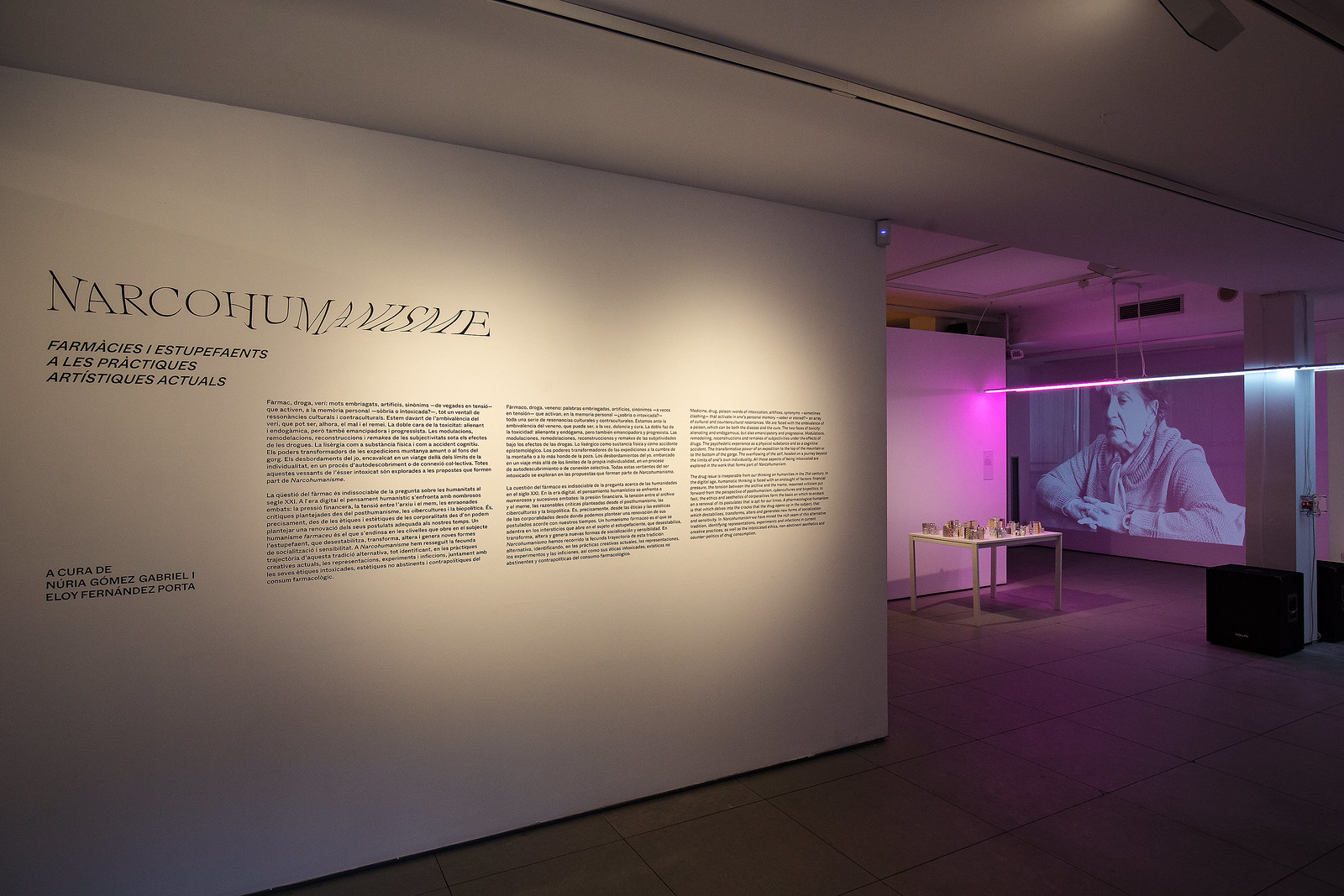
El BOLIT- Contemporary art center at Girona, Catalunya, 2022
Drug, drug, poison: intoxicating words, artifices, synonyms - sometimes in tension - that activate a whole series of cultural and counter-cultural resonances in the personal memory - sober or intoxicated. We are confronted with the ambivalence of poison, which can be both a disease and a cure. The double face of toxicity: alienating and endogenous, but also emancipatory and progressive. The modulations, transformations, reconstructions and remakes of subjectivities under the influence of drugs. Lysergic acid as a physical substance and as an epistemological accident. The transformative powers of expeditions to the top of the mountain or the depths of the pool. The overflowing of the self, embarking on a journey beyond the limits of one's own individuality, in a process of self-discovery or collective connection. All these aspects of the intoxicated self are explored in the proposals that form part of Narcohumanism.
Graphic design for Narco(H) is the result of a conversation between the curators, Núria and Eloy, and the light-spatial proposal by Óscar Martín. From the outset, the intention was to play with the title so that it would function as a plastic element in itself, as well as to transfer the curators' thesis to the graphic object, to bring us closer to a lysergic state in the reading of this title. The fonts used are: a distorted serif for "NARCOHUMANISME", specifically the ABC Arizona Serif designed by Elias Hanzer, the Akzidenz-Grotesk BQ font designed by H. Berthold for the subtitle, and a distorted serif for "NARCOHUMANISME", specifically the ABC Arizona Serif designed by Elias Hanzer, the Akzidenz-Grotesk BQ typeface designed by the type foundry H. Berthold for the subtitle, and a distorted serif for "NARCOHUMANISM", designed by Elias Hanzer. Berthold for the subtitles and other important information in the digital applications, and ABC WHYTE designed by Dinamo (Fabian Harb and Johannes Breyer, with Erkin Karamemet and Fabiola Mejía) for the printed texts.
The applications produced include social media kit and site-web, and printed formats such as leaflets, posters, room vinyls and posters.